Figure 3 shows a map of with stations named, grid cells numbered 1 to 9 and grid cells with no stations shaded grey.
Northern Siberia, Taymir
Peninsular Region
This review reveals shoddy scientific procedures used by the IPCC to conjure up glossy warming claims for the 1976-1999 period when in fact temperatures in that region have cooled slightly over 60 years.
Figure 1 shows the region being examined within a rectangle and the very eye catching IPCC presentation of warming trends 1976 to 1999 by 5 degree grid cells from Figure 2.9 in the IPCC Third Annual Report (TAR) draft.
Data Sources: The writer has examined CRU 1991, Jones 1994, V2 GHCN and GISS temperature records for this region.
The station by station data presented below is only from GISS for the following reasons;
Figure 2.9 from the TAR shows a
block of four maps and the first impression for any reader is
that the eye is drawn to the cluster of large red dots over
Siberia on the 1976-1999 map. In the TAR text
there is no qualification for this cluster of high warming
anomalies but Figure 2.10 goes on to present the four seasonal
1976-1999 global anomalies, where the winter & spring anomaly
also shows the eye-catching patch of Siberian high
magnitude warming anomalies leading the way in "global
warming".
Only a handfull of people would be familiar with temperature records from that region, so most readers of the TAR would carry away an impression that there is significant Siberian warming underway. The warming is in fact a partial recovery from a cold period in the early 1960's and vanishes rapidly if you choose a different starting year near 1976. The TAR mentions circulation perturbations that might make 1976 an interesting start point but that is no excuse for the portrayal of a region with little temperature trend as a major focus of global warming.
The data show that temperatures in that region have not yet recovered to levels seen in the 1940's.
Note also that the start point for the 1946-1975 anomaly map in the TAR Fig 2.9 does not correspond to the peak of the 1940's warming in the Jones 1994 global data. Those data peak in 1944, so if that anomaly map was 1944-1975 there would be more blue and less red. On the general subject of bias, why use red dots for zero values, can't they afford software that makes the zero's black ?
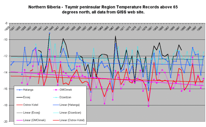
Figure 2 shows trends from five stations across the region and the salient facts are obvious, (a) that there is no warming trend 1940's to 1999 and (b) the data are very noisy and (c) warming or cooling can be measured over various periods depending on the start / finish years.
Figure 2

Figure 3 shows a map of
with stations named, grid cells numbered 1 to 9 and grid
cells with no stations shaded grey.
Figure 4 shows an enlargement of the subject region in Figure 1 with anomalies numbered 1 to 9 corresponding to numbers on the grid cell map Figure 3.
Non Climatic Warming
Two stations, Verhojansk Figure
5 and Olenek Figure 6
show obvious non climatic warming.
Olenek can be seen to be cooler than neighbours before 1967 and
warmer than neighbours after.
Verhojansk warms steadily compared to neighbours.
Two examples of non climatic warming not detected by statistical
or other homogeneity testing.
Comments by Grid Cells 1 to 9 as on the maps Fig 3 and 4.
[1] 77.5 N, 102.5 E
The only station Mys Celjuskin or GMO IMEKF cools slightly from
the 1940's, similar to Hatanga.
[2] 72.5 N, 102.5 E
The only station Hatanga cools slightly from the 1940's, see Fig
2.
[3] 67.5 N, 102.5 E
The only station, Essej is similar to neighbours, see Fig
2 For some reason the IPCC have no red dot anomaly
here, see Fig 4. Maybe Essej is short on data, extending
only to 1993.
[4] 67.5 N, 107.5 E
No stations in this grid cell. So the anomaly is
interpolated using the 8 neighbours; procedure yet to be
published I am told. No problems with reasonable
interpolations.
[5] 67.5 N, 112.5 E
In this grid cell we have Olenek with the non climatic warming
jump, see Figure 6. So the anomaly red circle number 5 in
Figure 4 is larger than it should be. Selagoncy only
has data to 1990 so may not contribute here.
[6] 67.5 N, 117.5 E
No stations in this grid cell, yet we see a LARGER red circle anomaly
than for neighbouring grid cells !! No
interpolation can look like this.
[7] 67.5 N, 122.5 E
Dzardzan cools slighlty since the 1940's see Fig 2, while
Zhigansk stops at 1990. Figure 4 shows a smaller red circle
anomaly here.
[8] 67.5 N, 127.5 E
No stations here but red circle anomaly is on a par with
number 9, the size of which is dictated by
Verhojansk, see Fig 5. No valid
interploation process I am aware of should produce a result like
this. This interpolation has four smaller neighbours
that should have pulled the size down.
[9] 67.5 N, 132.5 E
Only Verhojansk in this cell with the non climatic warming
see Fig 5. So this red circle anomaly is larger than
it should be.
Summary
[1] The IPCC are using non-climatic warming
trends as evidence of climate change.
[2] Interpolations of data to grid cells devoid
of stations ends up with higher warming trends than the parent
data ???
[3] Can anyone offer any explanations.
You read it first here
Posted 12, September, 2000
© 2000 Warwick Hughes,
www.globalwarming-news.com