Here is Sydney raw max & min annual temperature history –

This shows raw compared to ACORN also annual – you easily see where the effective adjustments are concentrated.

From 1 Jan 1983 on to present day there are no adjustments made to the daily max data. There are however some days when the raw reading is discarded to leave a data gap in ACORN. In the case of minimums (nightime) the data has no ACORN adjustments from 1 Jan 1964 to present day. But like the max – ACORN finds quite a few minimums not fit for ACORN.
Daily ACORN max minus raw max

Daily ACORN min minus raw min

To me it looks like machine driven stroking & tweaking.
Warwick, there seems to be no justification for the change, except that temperatures might have been higher in the past because Stevenson screens were not used.
The other issue highlighted in your data reveals their quality control of the data is poor. I have found the same with the Wangaratta data, where some readings are ridiculously high.
Finally, I was taught at school and college, that you never manipulate data. You may leave out rogue data, but you do not change a whole data set.
Ian Bryce
It seems to me that UHI is contributing fairly significantly to the Sydney raw data with monotonic increases as the surrounds become increasingly urbanised over the decades. I note also that the biggest surge in temperatures over recent times has been due to higher night time minimums, which would fit in well with surrounding fixtures releasing stored heat over the evening after the sun has gone down. So once again UHI being possibly the most significant factor at play here.
The difference between raw and ACORN on first look seems insignificant.
But a closer look at the temperature axis shows that and inappropriate scale has been selected. for zoom viewing and as a consequence you cannot see the adjustments clearly
I would like to see the axis enlarged to see how many fractions? of a degree have been adjusted up or down.
What would have been a common adjustment? 0.2 deg c ? more or less?
Really must bother to read up on this important but painful topic
Thanks WH for the post.
Warwick,
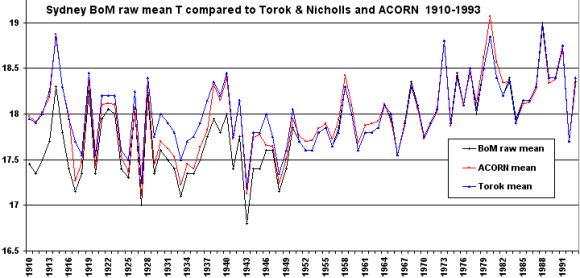
It might be interesting to compare ACORN with the BoM’s earlier Torok and Nichols series for Sydney which you presented here: www.warwickhughes.com/climate/gissbom.htm Are the warming trends in ACORN now even larger?
Hard to believe in ACORN’s purported “climatic” warming of c.1.5 degrees for Sydney when Newcastle raw data shown on your earlier page is flat to falling. Urban heat effects in Sydney would have to be large over this time scale, and particularly on the night-time minima, which ACORN leaves practically unchanged.
I notice that urban heat effects on ACORN data are discussed from page 71 here.cawcr.gov.au/publications/technicalreports/CTR_049.pdf
The problem seems to be the usual one that sites are classified into 3 tiers, with the assumption that “non-urban” sites, with population below 10 000, have no gradual urban warming. A more correct method would be to adjust in relation to long-term population CHANGE, so that a site that went from 100 people to 9 000 would get an adjustment.
The source says (p. 72) that Sydney’s increased minimum was not anomalous compared with neighbouring stations, but that is not surprising since those stations should have been adjusted too if, as is likely, their population has increased.
T & N adjusts more constantly than ACORN – I find it amazing that ACORN says Sydney raw is perfect after 1 Jan 1964 for minimums and 1 Jan 1983 for max.

T & N start both max & min adjustments at about 1950.
Of course it is standout obvious that there are no non-climatic influences in Sydney data after those dates.
Thanks Wazsah, you’re a pal.
Looks like there is not much difference in long-term trend between Torok and Nichols and ACORN, though they diverge for quite a while in the thirties.
You are dead right in your earlier comment that ACORN “looks like machine driven stroking & tweaking”. In Blair Trewin’s ACORN methods paper I linked to above there are something like 40 pages of adjustments for purported inhomegeneities, about half of which are not substantiated by any “metadata” (i.e., evidence), but simply identified by the application of arbitrary statistical tests.
As a whole his document is well-written and the mathematical handstands performed are breathtaking. In fact I wonder if any temperature series on earth has been stroked so many different ways. Pity he missed the elephant in the room – population growth around so many of the sites, especially around the coast.
To put numbers on each version warming over the 84 years 1910-1993 using the Excel linest function.
BoM raw warms at = 0.95° – ACORN warms at 0.58° and T & N warmed at 0.39°
Thanks again Wazsah. Interesting to know the effect of all the ACORN tweaking and stroking 1916-66 vs.Torok and Nichols.
.
ACORN made over 160 adjustments, nearly half of which were based only on arbitrary statistical rules, not on any evidence of an actual measurement anomaly at an individual site. An example of just one of these rules: “If fewer than 3 sufficiently-correlated sites existed with daily data around the time of the inhomogeneity, or the 10th best-correlated site with monthly data was better correlated than the 3rd best-correlated site with daily data, the monthly adjustment method was used.”
Even this test was carried out on data that had already been massaged with other tests to identify supposed internal inconsistencies. One issue that arises with the fantastic proliferation of tests is that you would get a different answer just by applying the same tests in a different order.
Meanwhile, no test at all for the elephant in the room – the rate of change in population at each site and how this varied over time..