A reader has drawn my attention to this map from page 27/36 IPCC WGI AR5 SPM-1 27 Sep 2013 – I am not sure what dataset is used (probably HadCRUT) – have not found the Technical Summary Supplementary Material yet. Have to say I was not aware such a large area of South America was warming as shown.

Interesting to compare with the GISS maps for the same period – fascinating how the different SST groups treat the Pacific Ocean – but the science is settled of course. This first map uses SST from the GISS combination of Hadley & Reynolds.

The second GISS map uses the NOAA ERSST data.

There are two main regions where warming is around 2 degrees or more – USSR and eastern tropical South America, mainly Brazil.
Two degrees warming in a century is a lot. So are the figures reliable?
Warwick you yourself investigated High Magnitude USSR Warming years ago and found huge warm biases. Steve McIntyre looked into one particular “whopper” warming station, and confirmed your analysis. Then a detailed and crushing investigation of HadCRUT Russian data by the Moscow Institute of Economic Affairs in 2009 concluded that
But apparently you, Steve and the IEA weren’t the only ones to notice that the high magnitude Russian/Siberian warming was hooey. A Climategate e-mail has Phil Jones bragging back in 2004 that he
The high magnitude Russia/Siberia warming is hogwash, only protected by CRU gatekeeping in the scientific literature.
And the Brazil warming may be no more robust. First, from your graphs, the IPCC graph seems to have smeared data from a few warming stations in GISS over a vast area of the hinterland – just as the IEA found for Russia. And second, there are probably major problems with contamination from urban heat. The population of Brazil rose twelve-fold over the period, and the warming pattern closely follows the population density map. As in all developing countries, there are virtually no stations outside cities or airports.
So the two largest hotspots have probably warmed much less than the IPCC claims. If that is so, then recent calculations of climate sensitivity based on observed temperatures would need to be scaled back even further, from around 2 degrees to more like 1 degree. Yet the IPCC fifth assessment report is touting dire predictions from models with a median sensitivity of 3.4 degrees.
That top image appears to be created from the NOAA Merged Land-Ocean Surface Temperature Analysis. It is a combination of GHCN and ICOADS data.
www.esrl.noaa.gov/psd/data/gridded/data.mlost.html
See Chapter 2 figure 2.21 middle graphic.
WUWT has a post with links to all the WG1 chapters. It appears none of them are final, the graphics aren’t set in proper position yet, but they can all be found at the bottom of the PDFs.
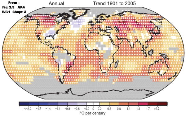
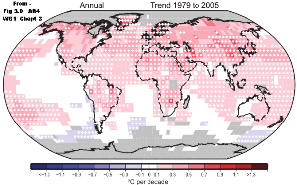
Came across these maps from AR4 – my pdf file was downloaded Mar 2009 – somebody might know when AR4 was released.


So it is clear that the booming warming trends from 1901 the IPCC finds over South America now in AR5 were not apparent in AR4.
From AR4 page 250 (16/102)
Figure 3.9. Linear trend of annual temperatures for 1901 to 2005 (left; °C per century) and 1979 to 2005 (right; °C per decade). Areas in grey have insufficient data to produce reliable trends. The minimum number of years needed to calculate a trend value is 66 years for 1901 to 2005 and 18 years for 1979 to 2005. An annual value is available if there are 10 valid monthly temperature anomaly values. The data set used was produced by NCDC from Smith and Reynolds (2005). Trends significant at the 5% level are indicated by white + marks.
I had an article from 2000 commenting on a similar map from the TAR –
Just found this block of 4 maps from the 2001 TAR –
From IPCC TAR WG1 Technical Summary2001
Figure 3: Annual temperature trends for the periods 1901 to 1999, 1910 to 1945, 1946 to 1975 and 1976 to 1999 respectively. Trends are represented by
the area of the circle with red representing increases, blue representing decreases, and green little or no change. Trends were calculated from annually
averaged gridded anomalies with the requirement that the calculation of annual anomalies include a minimum of 10 months of data. For the period 1901
to 1999, trends were calculated only for those grid boxes containing annual anomalies in at least 66 of the 100 years. The minimum number of years
required for the shorter time periods (1910 to 1945, 1946 to 1975, and 1976 to 1999) was 24, 20, and 16 years respectively. [Based on Figure 2.9]
Warwick, the first map is not easy to read with precision, but it looks as if the only 2 degree warming cell in South America is sitting on top of Sao Paolo. I wonder if it’s a coincidence that according to Quickiepedia Sao Paolo’s population has risen by a factor of 40 over the period in question, that it’s now the largest city in South America, and that it has the third highest density of buildings in the world – whereas in 1902 it looked like this: .
Image doesn’t work, try link to this