Various charts of Australian retail electricity prices and indices
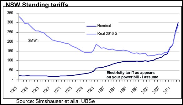
First from 2010 by UBS shows prices falling in real terms when power was generated by State Electricity Commission
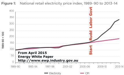
2nd Chart produced in 2014 during the carbon tax which was repealed mid-2014
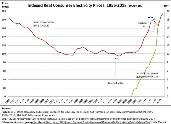
3rd Chart also starts 1955 but produced in 2017 and shows the quota of renewable power installed
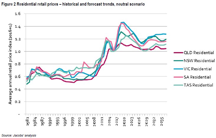
The 4th chart was generated for AEMO in May 2017 by Jacobs and also models the future
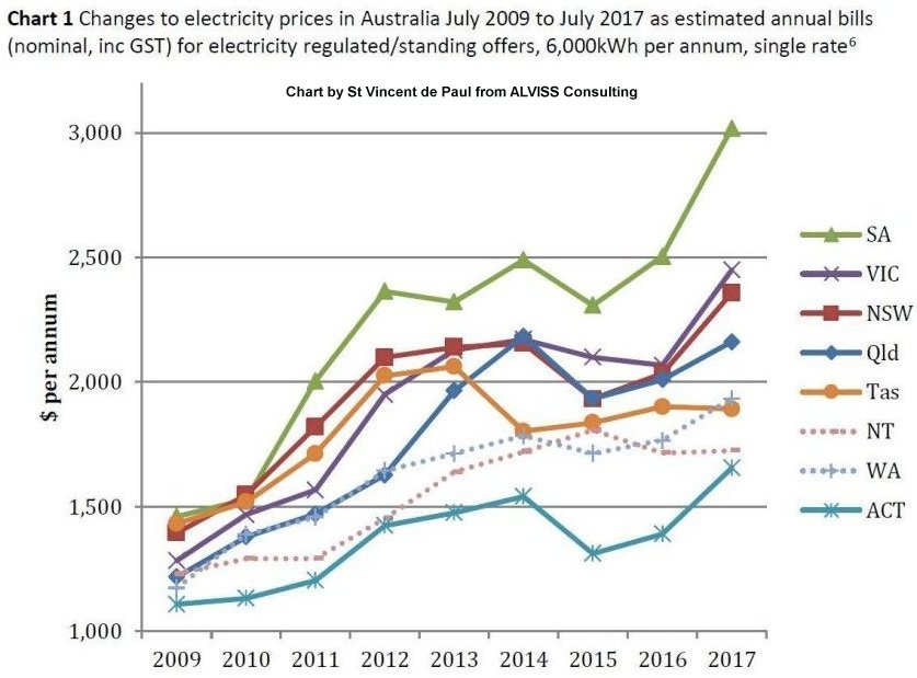
The 5th chart is from St Vincent de Paul from the second half of 2017 and shows power bills in dollars
Renewable Energy category at the blog lists many articles on electricity prices. If anybody finds other charts worth adding please let me know at the blog.